Redesigning two core enterprise device management platforms through an architectural revamp and reimagined design.
MY ROLE
Sole Product Designer
CLIENT
Telecommunications Company
SCOPE
Enterprise Products
METHODS
Participatory Design
TL;DR
The client's Device Enrollment Center had grown into a friction-heavy system across two portals, one for admins, one for customers, supporting $960M in revenue and 1.5M device enrollments annually. As the sole designer, I led the end-to-end redesign: auditing existing flows, collaborating weekly with product, architecture, and engineering, and designing around the real constraints of third-party enrollment programs and agentic AI integration to deliver two smarter, leaner platforms.
✺ CONTEXT
Outdated portals were creating friction for the teams and customers relying on them daily.
The client's Device Enrollment Center, used by both customers and internal admins, had accumulated years of structural debt. Manual workflows, redundant navigation, and no intelligent assistance made routine tasks harder than they needed to be.
Platform statistics: 1.5M device enrollments, 11.2K monthly visitors, 26.6K participating customers, $960M in supported revenue
✺ OUR PROBLEM STATEMENT
✺ THE OPPORTUNITY
An IBM-led AI workshop identified a significant opportunity for automation, and a redesign became the natural companion.
The workshop surfaced what the platform friction had been pointing to for some time: agents could meaningfully automate high-effort admin workflows. With a budget allocated and an architectural revamp already underway, both portals were scoped for a ground-up redesign alongside the AI implementation.
Interactive before and after: manual process today vs new agentic experience
✺ UNDERSTANDING THE PROBLEM SPACE
A multi-pronged audit uncovered friction across every layer of both portals.
I interviewed the admin team, who carry deep institutional knowledge of customer pain points, mapped every user flow across both portals in Figma, and shadowed admins to observe workflows firsthand.

User flow mapping example (1 out of 5)
✺ WHAT THE AUDIT REVEALED
The pain points were structural, not surface level.
Not every friction point carries equal weight. Across both portals, four themes emerged on each side with the highest impact on day-to-day operations.
Pain points from the UX audit, customer and admin portals
Navigation is repetitive and convoluted
Multiple pathways to the same task with no clear starting point.
Excess pages with low or no value
Pages like "Learn More" add friction without actionable guidance.
Critical paths hidden behind unnecessary steps
Registration and primary actions buried under deep navigation layers.
Disjointed user experience
Redundant information and step-heavy flows push customers toward manual support instead of self-service.
Homepage offers no operational visibility
No alerts, task prioritization, or system activity insight.
Partner programs duplicated across separate pages
ABM, Knox, and Zero Touch share identical functionality but live on separate pages.
Device tracking and queries are entirely manual
Admins scan raw transaction logs for errors and replace placeholder code in a text-only query interface with no UI support.
High manual burden and cognitive load
Nearly all workflows rely on manual data entry, log scanning, and code replacement.
✺ UNDERSTANDING TECHNICAL CAPABILITIES AND CONSTRAINTS
Weekly collaboration with architecture and engineering shaped what the designs could, and couldn't, do.
The most significant constraint came from the third-party enrollment programs: Apple Business Manager, Android Zero Touch, and Samsung Knox each require different data inputs and return different data structures. This created a design challenge on both portals: how to present a coherent, unified experience across fundamentally heterogeneous data sources. I also had to determine where AI agents could be integrated in ways that added genuine value without disrupting existing workflows.
Admin Portal - IMEI Intelligence Page
Admins had no source of truth for trouble shooting device errors, just raw JSON logs and disconnected systems.
Troubleshooting an IMEI meant manually scanning log files, then working backward across multiple systems to reconstruct what happened. There was no single place to see the full picture.
Final design screenshot [Identifying data has been scrubbed]
A dedicated IMEI page replaced logs with a clear, trustworthy view of every device.
Quick statuses, timestamps, and natural language descriptors replace opaque JSON. Progressive disclosure surfaces detail on demand. An AI chat interface lets admins query device history conversationally and trigger actions, enrollment, de-enrollment, and more, without leaving the page.
Trust is embedded throughout: success and failure states are explicit, transaction validations include descriptive text and step indicators, and pending states are called out in plain language. This also serves a change management function — easing admins into an AI-assisted workflow with the transparency needed to build confidence in the system.
Customer Portal — Redesigned Authenticated Homepage
Authenticated users landed on the same generic page as visitors — with no clear path to their primary task.
Registration is why most customers come to the site. But it took several clicks to find. Account information and activity were buried deeper still, creating circular navigation that pushed users toward support instead of self-service.
Final design screenshot [Identifying data has been scrubbed]
A personalized homepage, organized entirely around what users actually come to do.
A greeting and clear site context anchor the top. The primary action — Start a Registration — is the first thing a user sees. Below it, an Accounts section surfaces key details at a glance: account numbers and names. A Recent Activity table closes the page for users who return to troubleshoot.
Prioritization was driven by product analytics and refined through close collaboration with the sales and support teams who know the customer relationship best.
Accounting for data variance across programs required a flexible table design.
Apple Business Manager, Android Zero Touch, and Samsung Knox each return different data. The activity table resolves this through progressive disclosure — shared fields (IMEI, timestamp, program, request type, status, response) surface at the row level, with program logos providing immediate context. Expanding a row reveals program-specific details, keeping the table scannable without losing depth.
Final design screenshot [Identifying data has been scrubbed]
✺ CUSTOM COMPONENTS AND DESIGN SYSTEM
I contributed to the design system
This is how I did it
✺ OUTCOMES & RECEPTION
Stakeholder reception has been strongly positive ahead of production launch.
The sales team called the customer portal a major improvement over the current state. The admin portal was consistently met with feedback that it would meaningfully reduce time spent on manual workflows. The product team and fellow designers aligned quickly, citing clarity and usability as the primary strengths.
The engagement also required stepping beyond design. Amid shifting resources and unclear ownership mid-project, I took on a coordination role — keeping stakeholders aligned and the work moving forward through the transition.
Take a look at my other projects 𓀙
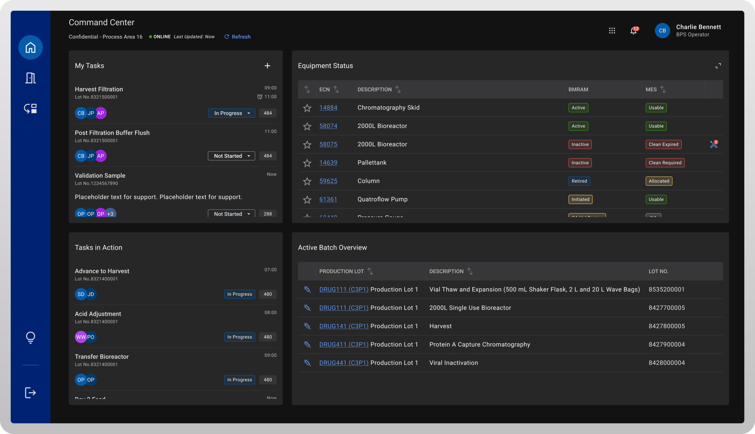
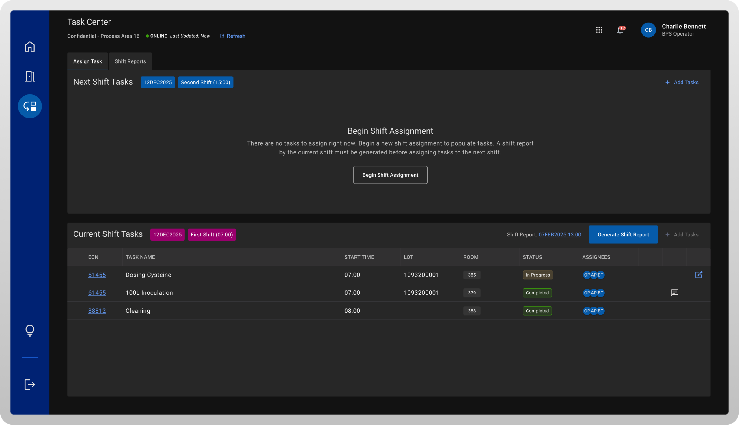
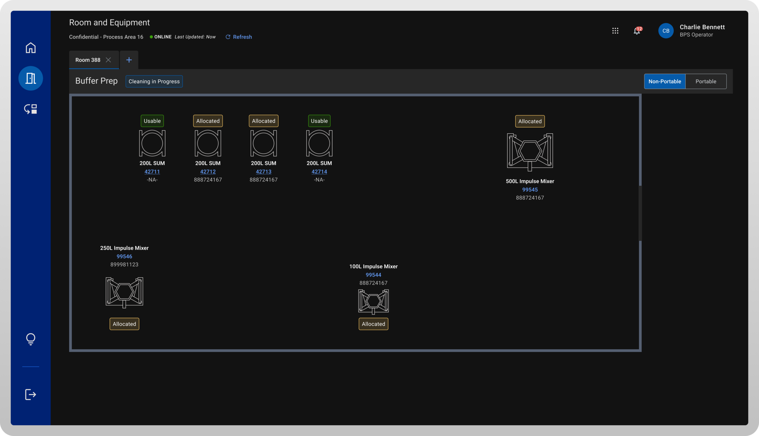
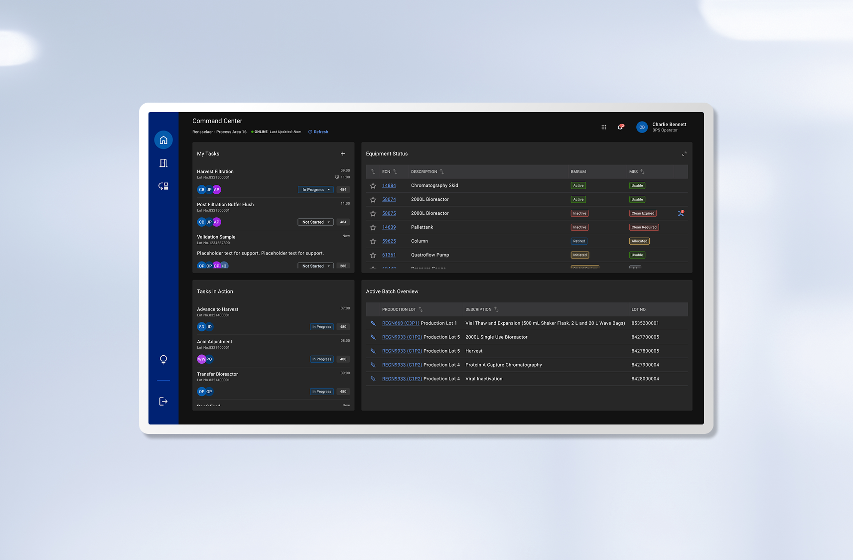
Designing a tool to enhance production operationsIBM Consulting
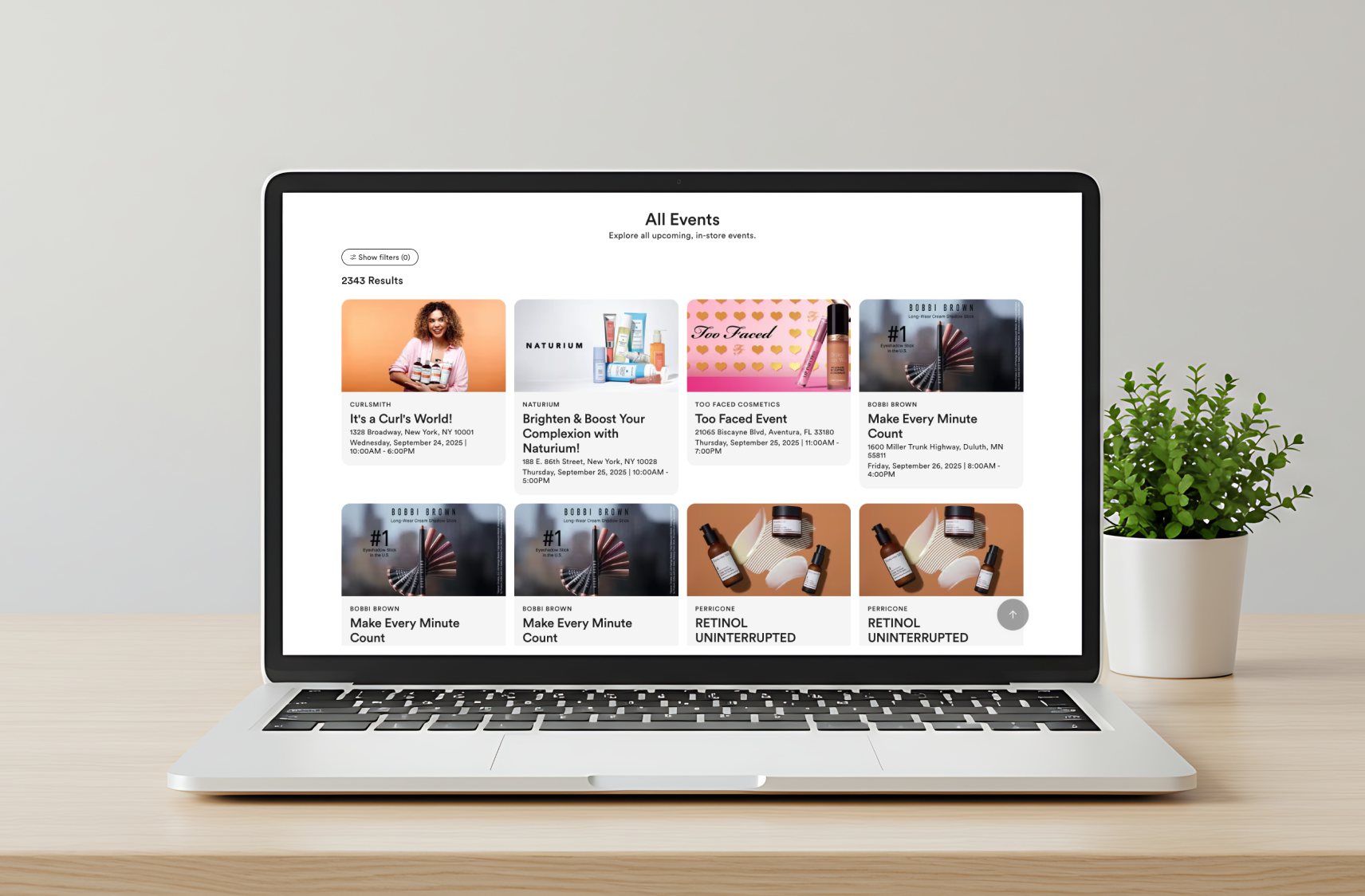
Shaping the future of Ulta Events through UXRIBM Consulting
Building a custom tool for manufacturing operationsIBM Consulting
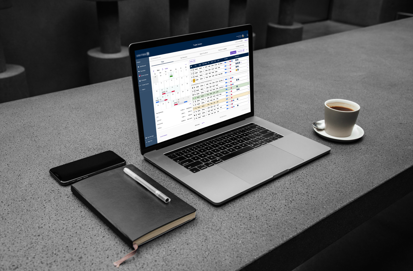
Modernizing a scheduling tool for pilotsProject type
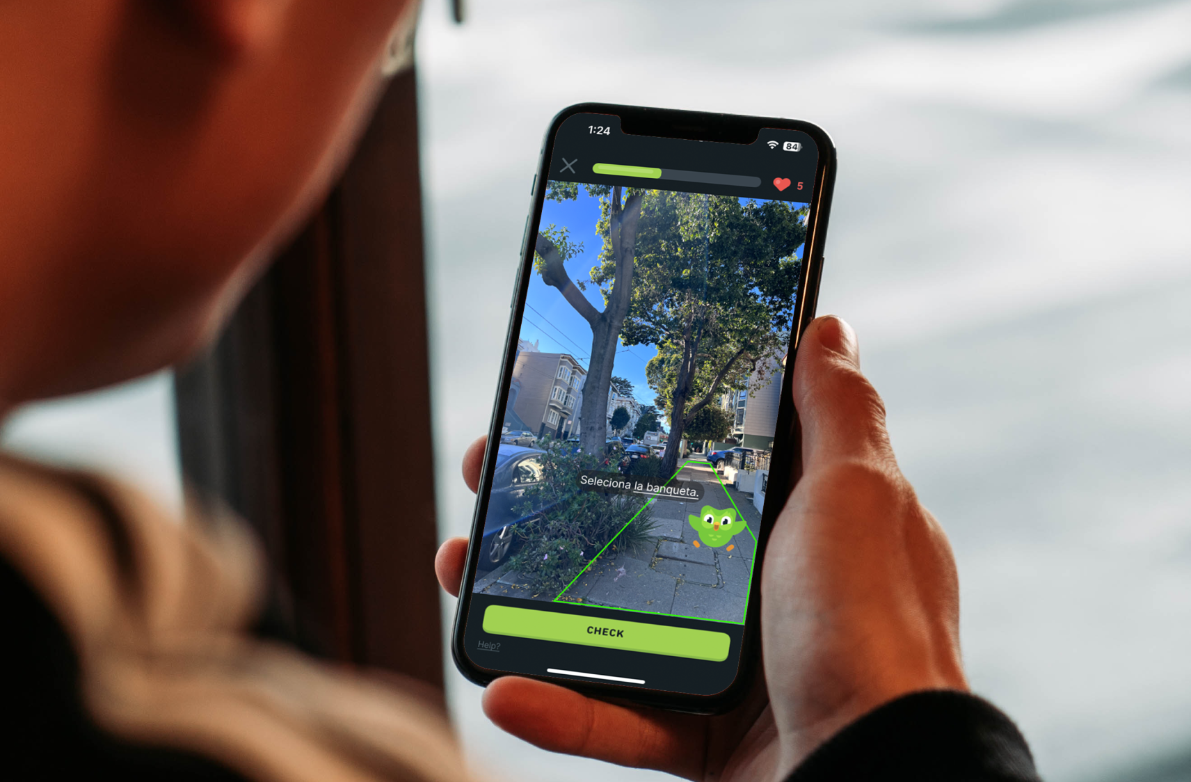
Streamlining the candidate hiring experienceIBM Internship Project