Defining a product vision for Jersey Mike's next generation of guests.

MY ROLE

UX Strategist & Designer

CLIENT

Jersey Mike's Subs

SCOPE

Native Mobile App 

METHODS

UX Assessment, Experience Principles

TL;DR

The Jersey Mike's app works, but as the brand pushes to become more digital-native and reach a younger, Gen Z audience, it needs to feel less like a functional ordering tool and more like an extension of the in-store brand. Through research and UX assessment analysis, the team delivered prioritized recommendations, defined a set of brand-rooted experience pillars, and designed select screens and a golden thread narrative to give the product team a tangible vision for what those recommendations could look like in practice.

JM Golden Thread Folio

Golden thread narrative, turning research into a tangible, target-state mobile journey for Jersey Mike's

✺  CONTEXT

Jersey Mike's wants to grow its digital reach, and reach a younger audience along the way.

The in-store experience at Jersey Mike's is built on quality, fresh-sliced ingredients, and a genuine sense of community. As the brand invests further in digital ordering to expand its customer base, drive more frequent orders, and grow its digital mix, the app needed to be evaluated against that same bar. 

⋆˙⟡ Watch to see pain points called out as they appear.

01 Home page looks the same for every guest, and misses easy merchandising opportunities
02 Menu is gated behind a "Start a New Order" commitment
03 Customization is inconsistent and takes too many clicks
04 In-store customizations, like halves and doubles, don't exist in the app
05 Upsells and pop-ups are generic, and engagement shows it

✺  THE PROCESS

We aimed to understand critical areas of friction to recommend how Jersey Mike's can increase digitial transactions and loyalty. 

Over five weeks, our team ran a rapid research study and UX assessment program across the app's core flows. I led the UX assessment portion. The findings defined future state experience pillars and a directional proof of concept. 

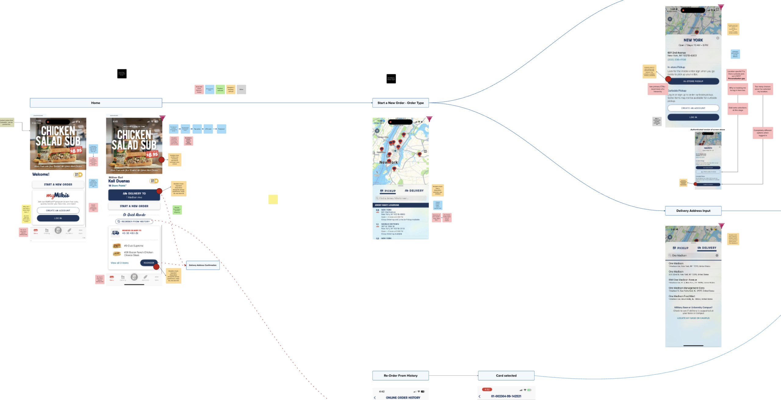
UX Audit Screenshot

Internal working view, annotated call-outs were then synthesized into patterns via affinity mapping

✺  WHAT THE RESEARCH REVEALED

After the inital assessment and research was concluded and synthesized, the patterns revealed six systemic pain points recurring throughout the entire app.

These findings are validated across user research, the UX assessment, and competitive analysis, and cross-referenced against real data like click-through and engagement rates.

Placement and communication feel unintentional

Account creation, upsells, and menu prompts show up at the wrong moments, adding friction instead of value.

Examples
  • Account creation offers no clear reason to sign up
  • Loyalty and account capture are missing entirely from catering
  • Upsells clash with what the customer is actually trying to do
  • Merchandising opportunities go largely unused
Personalization and customization fall short where they matter most

There's no infrastructure remembering who the customer is or what they want.

Examples
  • No personalization infrastructure exists across the app
  • Dietary and allergen info is missing from catering entirely
  • Active orders offer no real-time transparency
  • Upsells are generic, with no personalization layer
Small details compound into real friction

Inconsistent patterns and unnecessary steps add up across the experience.

Examples
  • No design system creates inconsistency across the app
  • "Make a Combo" takes too many clicks
  • Menu numbering and structure lack clear logic
  • Active orders are buried behind order history
  • Reorder hides the ability to customize, defaulting to a blind repeat
Key features lack the basics

Core functionality, edge cases, and permissions aren't fully thought through.

Examples
  • Navigating back to home is sometimes impossible
  • Payment method management is unclear and inconsistent
  • Group order permissions leave no one in control once the order is live
  • Content doesn't adapt to the customer's location
Loyalty and rewards lack visibility

Customers can't easily see what they've earned or what it's worth.

Examples
  • Point balances and redemption options are hard to understand
  • Rewards feel limited for how engaged customers are
  • No tiered benefits exist for frequent customers
  • Promotions can expire before customers notice them
Customization and ordering don't match the in-store experience

What's possible in-store isn't always possible, or clear, in the app.

Examples
  • Limited control over ingredient quantities (light, extra, on the side)
  • In-app customization doesn't match what's available in-store
  • Modification upcharges aren't clearly communicated
  • Combo options and add-ons are sometimes hidden in the flow

Click on a card to read examples.

✺  THE OPPORTUNITY 

To make the recommendations tangible, I built a persona and a golden thread narrative, designing key screens to bring specific moments to life.

Ten moments from Maya's journey, from the first notification to her next order, each screen and component designed to visualize a specific recommendation in context.

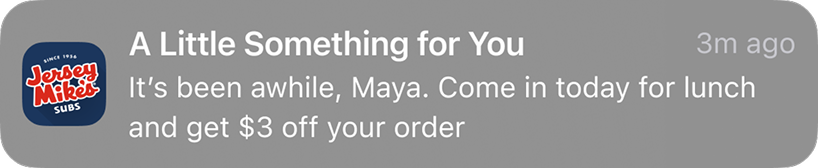
Push notification
Action 01 · Awareness
A notification pulls Maya in
Location and toast banner
Action 02 · Opening the App
Location and a toast banner set the context immediately
Browsing menu options
Action 03 · Browsing Menu
Browsing the menu without commitment
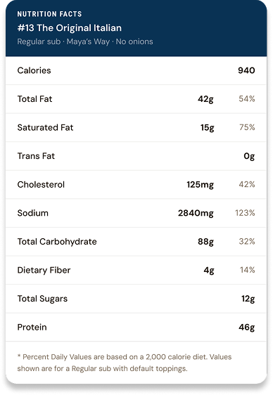
Nutritional label
Action 04 · Selecting an Item
Nutritional info surfaces without leaving the flow
Item customization
Action 05 · Item Customization
Just as it works in-storee
Upsell pop-over
Action 06 · One Last Add
A contextual upsell, not a generic one
Loyalty tier card
Action 07 · Order Confirmation
Loyalty tier progress, shown the moment it's earned
Order tracking
Action 08 · Order Tracking
Real-time visibility into the order
Next tier unlocked
Action 09 · Next Tier
A milestone worth celebrating
Future re-order notification
Action 10 · Future Re-Order
A notification invites Maya back
Push notification
Action 01 · Awareness
A notification pulls Maya in
Location and toast banner
Action 02 · Opening the App
Location and a toast banner set the context immediately
Browsing menu options
Action 03 · Browsing Menu
Browsing the menu without commitment
Nutritional label
Action 04 · Selecting an Item
Nutritional info surfaces without leaving the flow
Item customization
Action 05 · Item Customization
Just as it works in-store
Upsell pop-over
Action 06 · One Last Add
A contextual upsell, not a generic one
Loyalty tier card
Action 07 · Order Confirmation
Loyalty tier progress, shown the moment it's earned
Order tracking
Action 08 · Order Tracking
Real-time visibility into the order
Next tier unlocked
Action 09 · Next Tier
A milestone worth celebrating
Future re-order notification
Action 10 · Future Re-Order
A notification invites Maya back

✺  GROUNDING RECCOMENDATIONS IN THE BRAND

We defined experience pillars rooted in Jersey Mike's own brand, mission, and values, guardrails for how any new digital experience should show up.

Key themes include personalization, customization, loyalty, trasparency, and community.

Vision
Be the world's most beloved destination for authentic sub sandwiches
Pillar 01
A Sub Above Quality
Made With Care

Every experience should reflect craftsmanship, freshness, and pride in the details.

Bringing It to Life →
Bringing It to Life
  • Reflect fresh, premium ingredient standards through photography, close-ups, and copy at key decision points
  • Ordering should feel like participating in craft, easy customization of meat, toppings, and slicing
  • Deliver simple, seamless, consistent, and intuitive experiences throughout
  • Order accuracy and pickup/delivery-moment quality are non-negotiable
Pillar 02
Know Me Like a Regular
Make Every Guest Feel Known

Feel welcoming, personal, helpful, and connected to the community.

Bringing It to Life →
Bringing It to Life
  • Personalized recommendations and store-level personalization
  • Fast reorder functionality
  • Recognition of loyalty and frequency
  • Warm, friendly conversational tone for content and notifications
Pillar 03
The Juice
Something Special About This Place

Deliver moments of extra value, delight, and surprise beyond utility.

Bringing It to Life →
Bringing It to Life
  • Surprise rewards or offers
  • Gamified loyalty experiences
  • Generosity made visible through cause-based promotions and local partnerships
  • Delightful interactions and animations, used sparingly
Pillar 04
Rooted Authenticity
The Brand Knows Who It Is

Feel reliable, transparent, familiar, and authentic across every interaction.

Bringing It to Life →
Bringing It to Life
  • Protect signature rituals as the brand modernizes and scales
  • Maintain classic product standards and respect for brand heritage
  • Decisions guided by transparency to build long-term trust
  • Simplicity done exceptionally well

Every recommendation that followed was weighed against these four pillars, a way of making sure the push toward digital-native, Gen Z-friendly experiences never drifted from what makes the brand recognizable in the first place.

Recommendations Example  ⟢

Expanding Customization Controls

Bringing mobile customization closer to the flexibility of the in-store experience.


Experience Pillars in Play
Know Me Like a Regular A Sub Above Quality The Juice
Expand Customization Controls

Customers expect the app to support the same level of flexibility available when ordering in person.

"Just save my preferences, if I always say 'no onions' Mike's Way, just remember that."

What's Working
  • Basic customization already exists, but needs to evolve to meet expectations
What's Not
  • Limited controls for ingredient quantities or "on the side" options
  • Inconsistent toppings list from sub to sub
  • Hard to find allergen, dietary, or nutritional info
  • Unclear upcharges for extras and customizations
7.6%
Current drop-off, product page to cart
↓3%
Target reduction, add to cart to checkout

Bring mobile customization closer to the flexibility of the in-store experience.

"I want to know exactly what's going on my sandwich."

Achievable Now
  • Add granular ingredient controls, light, regular, extra
  • Allow toppings and condiments "on the side"
  • Provide all topping options to all subs, just like in-store
  • Make allergen, dietary, and nutritional info easy to find
Enhanced Maturity
  • Remember and surface repeated modifications
  • Support split or half-and-half customizations
  • Expand analytics across the customization journey
  • Use customization data to refine customer profiles
Annotated phone screenshot showing customization pain points

Annotated phone screenshot
(current-state pain points)

Redesigned customization screen with improved ingredient controls

Redesigned customization screen
(opportunity state)

✺  OUTCOMES & NEXT STEPS

The engagement gave Jersey Mike's a shared, brand-grounded roadmap, not a finished redesign, but a clear, prioritized point of view on where the app needs to go next.

Recommendations were split into achievable-now UI fixes (consistent topping order, visual cart confirmation, clearer empty states) and longer-term capability investments (a true personalization layer, a loyalty and rewards engine, real-time content delivery), giving the team a way to sequence what could ship soon versus what needed a longer runway.

© 2026 Sarahy Duenas 
Made with ♥ in NYC

𓆝 𓆟 𓆞 𓆝 

sarahyduenas01@gmail.com 
View my LinkedIn